Tidy Tuesday analysis of European energy production from 2016 to 2018.
tidy-tuesday
Author
Mark Druffel
Published
August 13, 2021
Background
European energy data Data
This Tidy Tuesday, I’m analyzing European energy data. I don’t know much about the data set, but it seems like it contains European energy production data. To download the data I use the tidytuesdayR package.
This data set came with two data frames. Both data frames go from 2016 to 2018. The first data frame, country totals, has the country’s energy total production, imported, exported, absorbed by pumping, and total supplied. The write-up provides the helpful hint that supplied = (energy produced + imported - exported - absorbed by pumping).
Code
skim(country_totals)
Data summary
Name
country_totals
Number of rows
185
Number of columns
7
_______________________
Column type frequency:
character
4
numeric
3
________________________
Group variables
None
Variable type: character
skim_variable
n_missing
complete_rate
min
max
empty
n_unique
whitespace
country
0
1.00
2
2
0
37
0
country_name
5
0.97
5
20
0
36
0
type
0
1.00
7
26
0
5
0
level
0
1.00
5
5
0
1
0
Variable type: numeric
skim_variable
n_missing
complete_rate
mean
sd
p0
p25
p50
p75
p100
hist
x2016
1
0.99
45207.06
99814.70
0
1620.50
8426.0
29583.31
614155.0
▇▁▁▁▁
x2017
0
1.00
45413.37
100337.16
0
2204.74
8189.7
30676.00
619059.0
▇▁▁▁▁
x2018
0
1.00
45062.34
98010.77
0
2186.68
8326.0
31671.10
571799.7
▇▁▁▁▁
The second data frame, energy types, has the total energy production by power plant type. Unfortunately, the write-up didn’t provide more info regarding the types, but I think conventional thermal most likely includes the common fossil fuel power plants such as coal & natural gas.
Code
skim(energy_types)
Data summary
Name
energy_types
Number of rows
296
Number of columns
7
_______________________
Column type frequency:
character
4
numeric
3
________________________
Group variables
None
Variable type: character
skim_variable
n_missing
complete_rate
min
max
empty
n_unique
whitespace
country
0
1.00
2
2
0
37
0
country_name
8
0.97
5
20
0
36
0
type
0
1.00
4
20
0
8
0
level
0
1.00
7
7
0
2
0
Variable type: numeric
skim_variable
n_missing
complete_rate
mean
sd
p0
p25
p50
p75
p100
hist
x2016
0
1
12783.36
41066.36
0
0
373.28
5677.25
390141.0
▇▁▁▁▁
x2017
0
1
12910.96
41029.50
0
0
351.89
5924.46
379094.0
▇▁▁▁▁
x2018
0
1
12796.20
39423.36
0
0
278.35
6790.15
393153.2
▇▁▁▁▁
Up-front data cleaning
Based on a review of the data, we can filter to level="Level 1" for most analysis we’d want to do. According to the write-up provided, level two is a subgroup of level one and therefore double counts production. There is only one level two subgroup in the data set so there’s not a ton to analyze. There were also some missing values in country_name that were easy to impute based on country. I changed country codes for the United Kingdom and Greece to match the country codes in ggflags (we’ll use that later).
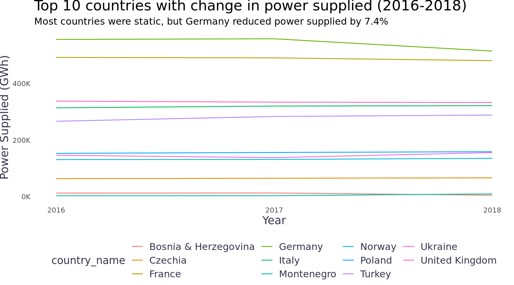
First, we can look at the total power supplied by country to see if the total amount supplied changed over the time period. The changes in production will be interesting as well, but given imports / exports we’ll want to first look at whether the populations were receiving less power (or the excess was going to exports). Only Germany saw a notable change.
Code
country_totals |>filter(type =="Energy supplied") |>pivot_longer(cols =contains("201"), names_to ="year", values_to ="gwh") |>mutate(year =as.integer(str_replace(year, "x", ""))) |>group_by(country) |>mutate(supplied_change = gwh -lag(gwh, n =2, order_by = year),supplied_change_abs =abs(gwh -lag(gwh, n =2, order_by = year))) |>mutate(supplied_change =max(supplied_change, na.rm = T),supplied_change_abs =max(supplied_change_abs, na.rm = T)) |>ungroup() |>mutate(country_name =fct_lump(country_name, n =11, w = supplied_change_abs)) |>filter(country_name !="Other") |>group_by(year, country_name) |>summarise(gwh =sum(gwh), .groups ="drop") |>ggplot(aes(x = year, y = gwh, color = country_name)) +geom_line() +scale_y_continuous(labels =label_number(scale =1/1000, suffix ="K")) +scale_x_continuous(breaks =c(2016, 2017, 2018)) +labs(y ="Power Supplied (GWh)", x ="Year", title ="Top 10 countries with change in power supplied (2016-2018)",subtitle ="Most countries were static, but Germany reduced power supplied by 7.4%") +theme_blog() +theme(legend.position ="bottom")
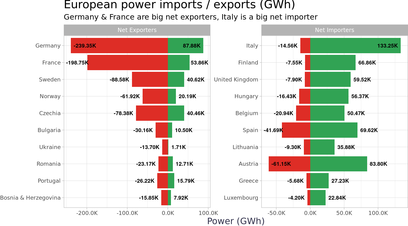
Next, we can use analyze country totals to understand the impact of imports / exports. Overall, the group is a net importer by 1.2915092^{4} GWh, but the picture is different by country. Below are the largest net exporters, Germany & France by a wide margin, and the largest net importers, Italy by a wide margin.
Code
country_totals |>filter(type %in%c("Imports", "Exports")) |>pivot_longer(cols =contains("201"), names_to ="year", values_to ="gwh") |>filter(!is.na(gwh)) |>group_by(country, country_name, type) |>summarise(gwh =sum(gwh), .groups ="drop") |>pivot_wider(names_from = type, values_from = gwh) |>clean_names() |>filter(!(exports ==0& imports ==0)) |>mutate(total = exports + imports, net = exports - imports, type =if_else(net >0, "Net Exporters", "Net Importers")) |>group_by(type) |>slice_max(n =10, order_by =abs(net)) |>mutate(country_name =fct_reorder(country_name, abs(net))) |>ungroup() |>filter(country_name !="Other") |>ggplot(aes(y = country_name)) +geom_col(aes(x = imports), fill ="#31a354") +geom_text_repel(aes(x = imports, label =label_number(scale =1/1000, suffix ="K")(imports)), nudge_x =1000, size =3, fontface ="bold", direction ="x") +geom_col(aes(x =-exports), fill ="#de2d26") +geom_text_repel(aes(x =-exports, label =label_number(scale =1/1000, suffix ="K")(-exports)), nudge_x =-1000, size =3, fontface ="bold", direction ="x") +scale_x_continuous(labels =label_number(scale =1/1000, accuracy = .1, suffix ="K")) +facet_wrap(~type, scales ="free") +labs(title ="European power imports / exports (GWh)", y =NULL, x ="Power (GWh)",subtitle ="Germany & France are big net exporters, Italy is a big net importer ") +theme_blog_facet()
Italy’s net imports are larger than the next two countries (Finland & UK) combined!
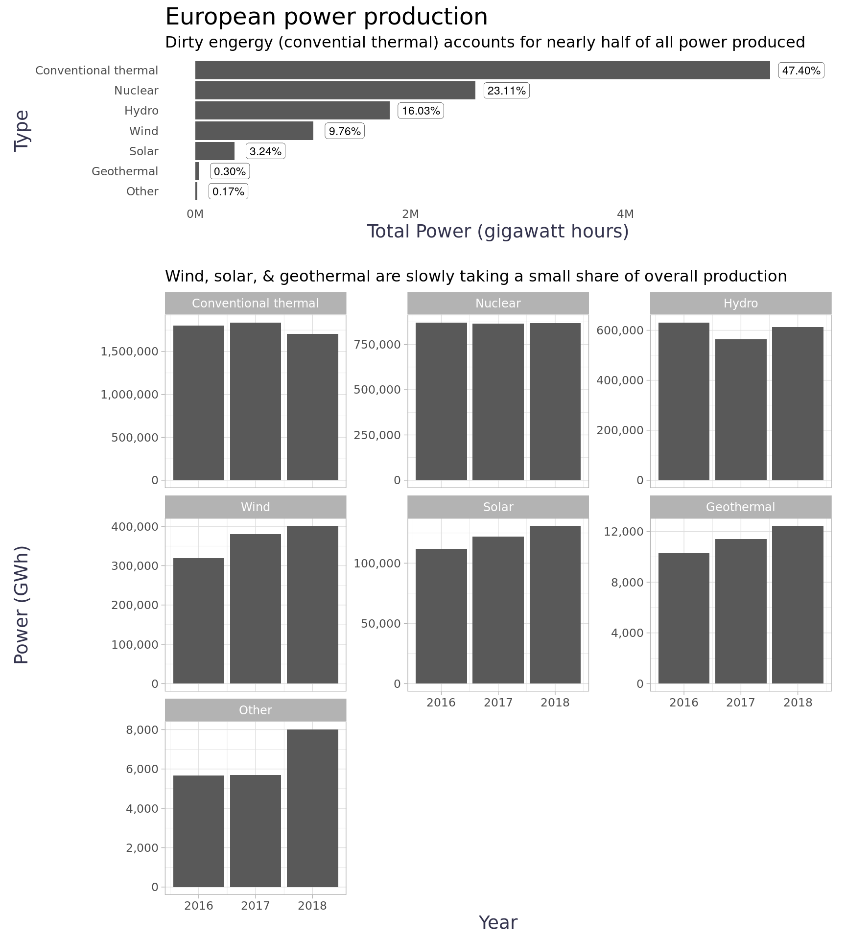
Energy Types
Switching gears, we can get a better understanding of the country totals by looking at the production details in the energy types data. The majority of power produced came from conventional thermal sources (i.e. fossil fuels), but it did have a slight decline in 2018. A few of the renewable categories saw significant growth (e.g. wind, solar, geothermal), although the impact in total power produced for those categories was still small.
Code
totals_by_type <- energy_level1_types_totals |>mutate(type =fct_reorder(type, gwh)) |>ggplot(aes(x = gwh, y = type)) +geom_col() +scale_x_continuous(labels = scales::label_number(scale =1/1000000, suffix ="M")) +geom_label(aes(label = scales::label_percent()(pct_of_total)),nudge_x =290000,size =3,label.size = .1,label.padding =unit(0.2, "lines") ) +labs(title ="European power production",subtitle ="Dirty engergy (convential thermal) accounts for nearly half of all power produced ",y ="Type",x ="Total Power (gigawatt hours)" ) +theme_blog()totals_by_year <- energy_types |>filter(level =="Level 1") |>group_by(year) |>group_by(year, type) |>summarise(gwh =sum(gwh, na.rm = T),.groups ="drop" ) |>mutate(type =fct_reorder(type, -gwh, sum) ) |>ggplot(aes(x = year, y = gwh)) +geom_col() +scale_y_continuous(labels = comma) +facet_wrap(~type, scales ="free_y") +labs(title =NULL,subtitle ="Wind, solar, & geothermal are slowly taking a small share of overall production",y ="Power (GWh)",x ="Year",fill ="Type" ) +theme_blog_facet() +theme(legend.position ="bottom")(totals_by_type /plot_spacer() / totals_by_year) +plot_layout(heights =c(1, .1, 4))
To better understand the changes we saw in the category totals, we can use a slope graph for each country. Given there are 37 countries and 7 types, it gets a bit crowded to print the country names across a faceted plot. We can use ggflags instead of spelled out names to plot the flags as points. It’s not perfect because most people won’t know all 37 flags, but it works. Additionally, given the skew in power production we can use a log10 scale to get some separation between countries (at least a bit more). The plot shows the top few producers in each type pretty nicely, but we can use ggiraph to make the graph a bit more readable by adding a tooltip and an inverse hover opacity on other countries. Unfortunately, I couldn’t figure out how to attach the tooltip to the flags in ggiraph so the hover only works on the slope line. Not perfect, but still pretty nifty. Germany accounts for a lot of the change because they lowered Conventional thermal and added Wind and Solar. Similar trends showed up in France, Ukraine, The Netherlands, and a few others. Turkey added production in all categories except hydro which they reduced. All these changes seem like they could reflect strategies related to global climate change.
Given the trends, it seems interesting to look at how much power is coming from clean sources versus dirty sources. The definition of clean and dirty is highly controversial and really a topic for a different blog (and data set), but we can try to group power sources based on their relative carbon footprint which basically puts everything but conventional thermal in a low carbon group (assuming other is probably biofuel or something like that, it’s so small it won’t make a difference). I understand this grouping is very crude. I’d like to approximate carbon footprint per GWh for the types and do some carbon estimations, but many of the groups would make that very difficult. Conventional thermal is a super-group of the major polluters (where much of the carbon comes from), but the different types within that group vary a great deal (i.e. natural gas vs. coal). We have no info about the Other group so we can only guess and it’s likely many types as well… anyhow, all this to say - please excuse the over simplicity of clean vs. dirty for the purposes of this post.
Code explainer
There are many ways we could view this data. Typically, we’d want to look at this as a time series to understand the impacts of change, but three years of this data just wasn’t long enough with this data set for that to be useful. Initially, I thought it’d be interesting to do a rose chart 1 splitting up clean and dirty, but I decided to use a lollipop 2 instead because it ended up being a very interesting visual. Once I got the chart in place, I realized there was still a lot of context I wanted to surface so I embedded a flextable 3 into ggiraph’s tooltip. 4
Visual Explainer
Each country in the data set has a spoke on the wheel. The height of the point (lollipop) on each spoke represents the percent of total power produced that came from clean sources. Albania had 100 percent of their power come from clean sources and Malta had 0 percent come from clean sources. The order of the countries is by total power produced starting with Germany and running clockwise. The size of the point also provides this for scale. The color of the point represents the change in dirty power produced from 2016 through 2018. Red points increased overall production from dirty sources and blue dots reduced overall production from dirty sources. Finally, when hovering over the dot, a tooltip shows a table with a scaled bar chart of the data for that country. Each bar is a year of power production, if the bar goes up it means that year was larger relative to the other years and if it goes down it was lower relative to the other years. The fill (color) groups the bars based on their relative position (up or down compared to other years).
Code
# Setup df ####low_carbon <-c("hydro", "wind", "solar", "nuclear", "geothermal", "other")high_carbon <-"conventional thermal"lolli_df <- energy_types |>mutate(carbon_level =case_when(str_to_lower(type) %in% low_carbon ~"low",str_to_lower(type) %in% high_carbon ~"high", T ~"Error")) |>group_by(country, country_name, year, carbon_level) |>summarise(gwh =sum(gwh), .groups ="drop") |>pivot_wider(id_cols =c(country, country_name), names_from =c(carbon_level, year), values_from = gwh) |>mutate(total_2016 = low_2016 + high_2018,total_2017 = low_2017 + high_2017,total_2018 = low_2018 + high_2018,pct_low_2016 = low_2016 / total_2016,pct_low_2018 = low_2018 / total_2018,high_change = (high_2018 - high_2016) / high_2016,country_name =fct_reorder(country_name, -total_2018, sum),segment =row_number(-total_2018)) |>mutate(high_change =if_else(is.nan(high_change), 0, high_change))# Create tooltip ####gg_bars <-function(z) { z <-scale(z) z <-na.omit(z) z <-data.frame(x =seq_along(z), z = z, w = z <0)ggplot(z, aes(x = x, y = z, fill = w)) +geom_col(show.legend =FALSE) +geom_hline(aes(yintercept =0), alpha = .9, color ="#525252", size = .25) +scale_fill_discrete_diverging(palette ="Green-Orange", rev = T) +theme_void() }lolli_df$tooltip <-map_chr(unique(lolli_df$country), function(x){ lolli_data <- lolli_df |>filter(country == x) |>pivot_longer(cols =contains("201"), names_to ="type_year", values_to ="gwh") |>select(-high_change, -segment) |>filter(!str_detect(type_year, "pct")) |> tidyr::separate(col = type_year, sep ="_", into =c("type", "year")) |>mutate(year =as.integer(year)) |>mutate(type =case_when( type =="high"~"Dirty Sources", type =="low"~"Clean Sources", T ~"Total" )) bar_dt <- energy_types |>select(-level) |>filter(country == x) |>bind_rows(lolli_data) |>mutate(type_order =case_when(str_to_lower(type) %in% high_carbon ~1, type =="Dirty Sources"~2,str_to_lower(type) %in% low_carbon ~3, type =="Clean Sources"~4, type =="Total"~5 )) |>mutate(Type =fct_reorder2(type, year, type_order, min)) |>rename("GWh"="gwh") bar_dt <-as.data.table(bar_dt, key =c("type_order", "year")) z <- bar_dt[,lapply(.SD, function(x) list(gg_bars(x))), by =c("Type"), .SDcols =c("GWh") ] ft <-flextable(z) ft <-compose(ft, j =c("GWh"),value =as_paragraph(gg_chunk(value = ., height = .25, width =1)),use_dot =TRUE ) ft <-compose(ft, j =c("GWh"),part ="header",value =as_paragraph("GWh ",as_chunk(" (2016-2018)",props =fp_text_default(font.size =9, vertical.align ="superscript") ) ) ) ft <-add_header_lines(ft, values ="Yearly Change in Production (GWh)") ft <-bold(ft, part ="header", bold =TRUE) ft <- ft |>bold(~Type %in%c("Dirty Sources", "Clean Sources", "Total")) |>hline(i =2, border =fp_border(color ="#525252", width =1)) |>hline(i =9, border =fp_border(color ="#525252", width =1)) |>hline(i =10, border =fp_border(color ="#525252", width =1)) ft <-set_table_properties(ft, layout ="autofit") ft <-as.character(htmltools_value(ft, ft.shadow =FALSE))return(ft)})# Create Plot ####high_change_limits <-c(min(lolli_df$high_change), max(lolli_df$high_change))p <- lolli_df |>ggplot(aes(x = segment)) +geom_hline(aes(yintercept =100), alpha = .9, color ="#525252") +geom_hline(aes(yintercept =50), alpha = .5, color ="#858585", linetype ="twodash") +geom_hline(aes(yintercept =0), alpha = .9, color ="#525252") +geom_segment(aes(xend = segment, y =0, yend = pct_low_2018 *100), size = .25, color ="#525252", alpha = .9 ) +geom_segment(aes(xend = segment, y = pct_low_2018 *100, yend =110), size = .25, color ="#525252", alpha = .25, linetype ="twodash" ) +geom_text(aes(x = segment, y =112, label = country_name), family ="Lato", size =5, fontface ="bold") +annotate("text", x =0, y =96, label ="100%", alpha = .75, size =5, family ="Lato", fontface ="bold") +annotate("text", x =0, y =46, label ="50%", alpha = .75, size =5, family ="Lato", fontface ="bold") +geom_point_interactive(aes(y = pct_low_2018 *100, size = total_2018, color = high_change, tooltip = tooltip, data_id = country)) +scale_color_binned_diverging(n.breaks =5, labels =c("-50%", "", "0%", "", "150%"), c1 =200, cmax =200, palette ="Blue-Red-2", n_interp =7, mid =0) +scale_size_continuous(labels =label_number(accuracy =1, n.breaks =7, scale =1/1000, suffix ="K"), range =c(1, 12)) +labs(title ="Low carbon power production (percent of total)",subtitle =str_wrap(width =125, "Many countries produced > 50% of power w/ clean sources, but many also added to their over overall dirty energy production"),size ="2018 Power (GWh)", color ="Change in Dirty Power (GWh) 2016-2018",caption ="Clean: hydro, wind, solar, nuclear, geomthermal, other\nDirty: conventional thermal " ) +coord_polar() +ylim(-20, 115) +theme_void() +theme(plot.title =element_text(family ="Lato", size =24, face ="bold"),plot.caption =element_text(family ="Lato", size =10),plot.subtitle =element_text(family ="Lato", size =14),legend.position ="bottom", legend.title =element_text(family ="Lato", size =12, face ="bold"),legend.text =element_text(size =12))# Print plot #### girafe(ggobj = p, fonts =list(sans ="Roboto"), width_svg =16, height_svg =16,options =list(opts_tooltip(css ="padding:5px;background:white;border-radius:2px 2px 2px 2px;"),opts_hover_inv(css ="opacity:0.5;"),opts_hover(css ="stroke-width:2;") ))
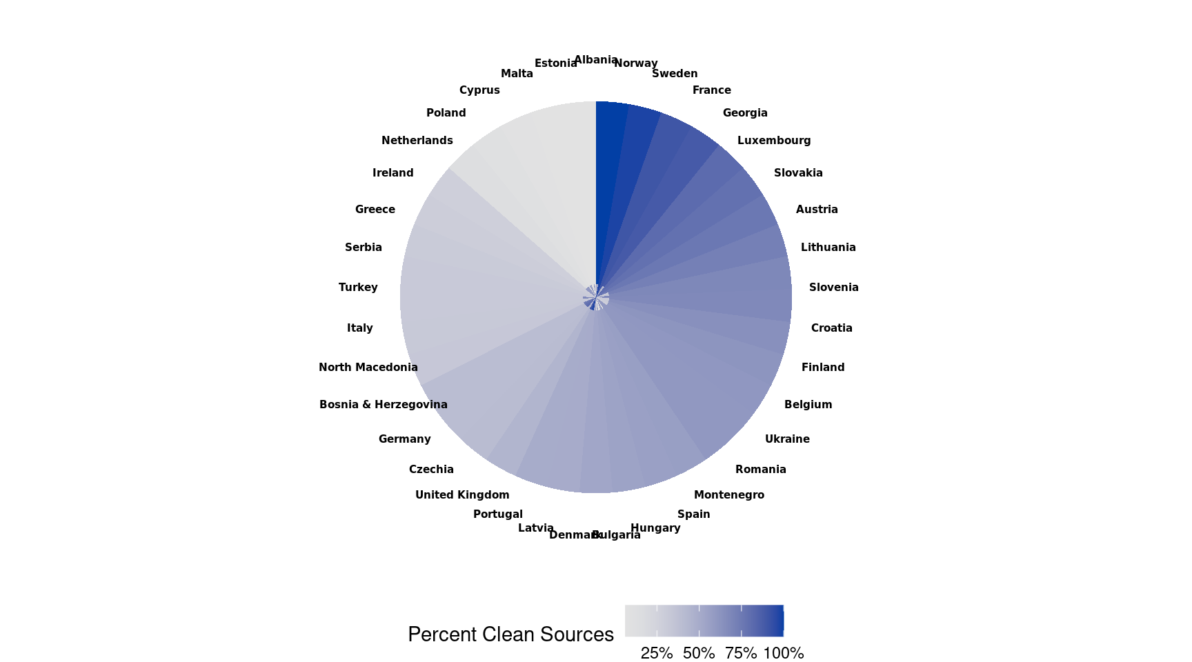
Not another pie chart
While building the above lollipop chart, I had the idea to create a shaded area in the negative space above the dot (i.e. the dirty energy) and I stumbled on another way to make a pie chart that’s h harder than simply using geom_col. It also has a small sensless pie chart in the center, I believe because coord_polar couldn’t fold a rectangle into those slices evenly? I decided not to finish the envisioned shaded area because the visual was already feeling a bit too complicated as it stood, but I wanted to keep this failed attempt because it was a good learning experience.
A map because people love maps! Seriously though, mostly because as I was working on this I stumbled back across the rnaturalearth, which is an amazing package to keep in the toolkit for spatial data. It provides easy to use data frames with sf data, census data, reference data, etc. In this case, I used the ne_countries() function to get country data that I could join with my energy data frame. There’s a lot more analysis we could do with the data it provided, but below is a choropleth map of the percent of total power from clean sources. 5
We could take this analysis a lot further, but I learned a few new things in this exercise. It was my first time using ggflags and I worked with polar coordinates in ggplot2 quite a bit. Based on our analysis, it looks like Europe (as of a couple years ago) has quite a lot of ground to cover in reducing their carbon impact - not unlike the rest of us.
Footnotes
This stackoverflow post provides the gist of what’s needed to create a rose chart.↩︎
This stackoverflow post gave a stupid simple example for creating a lollipop chart.↩︎
---title: "European Energry"subtitle: "Tidy Tuesday analysis of European energy production from 2016 to 2018."author: "Mark Druffel"date: "2021-08-13"categories: ["tidy-tuesday"]keywords: ["ggplot2","ggiraph","ggflags","flextable","sf","rnaturalearth","leaflet"]image: images/radial_lollipop.pnglink-external-newwindow: truelink-external-icon: truecode-fold: truecode-overflow: scrollcode-line-numbers: truecode-tools: trueexecute: eval: true echo: true warning: false error: false freeze: auto---## Background### European energy data DataThis [Tidy Tuesday](https://github.com/rfordatascience/tidytuesday), I'm analyzing European energy data. I don't know much about the data set, but it seems like it contains European energy production data. To download the data I use the [tidytuesdayR](https://github.com/rfordatascience/tidytuesday) package.```{r get_gh_data, cache=T, include = F}tt <- tidytuesdayR::tt_load("2020-08-04") ``````{r setup, message = F, warning = F, echo = T}knitr::opts_chunk$set(echo = T, message = F, warning = F, error = F, fig.width =9)library(knitr)library(htmltools)library(markUtils)library(tidyverse)library(janitor)library(skimr)library(magrittr)library(scales)library(patchwork)library(tidytext)library(ggiraph)library(ggflags)library(ggrepel)library(ragg)library(colorspace)library(flextable)library(data.table)library(officer)library(sf)library(rnaturalearth)library(leaflet)energy_types <- tt |>pluck("energy_types") |>clean_names("snake")country_totals <- tt |>pluck("country_totals") |>clean_names("snake")```## Analysis This data set came with two data frames. Both data frames go from 2016 to 2018. The first data frame, country totals, has the country's energy total production, imported, exported, absorbed by pumping, and total supplied. The write-up provides the helpful hint that `supplied = (energy produced + imported - exported - absorbed by pumping)`. ```{r skim_country_totals}skim(country_totals)```The second data frame, energy types, has the total energy production by power plant type. Unfortunately, the write-up didn't provide more info regarding the types, but I think [conventional thermal](https://en.wikipedia.org/wiki/Thermal_power_station) most likely includes the common fossil fuel power plants such as coal & natural gas. ```{r skim_energy_types}skim(energy_types)```### Up-front data cleaningBased on a review of the data, we can filter to `level="Level 1"` for most analysis we'd want to do. According to the write-up provided, level two is a subgroup of level one and therefore double counts production. There is only one level two subgroup in the data set so there's not a ton to analyze. There were also some missing values in `country_name` that were easy to impute based on `country`. I changed `country` codes for the United Kingdom and Greece to match the country codes in [ggflags](https://github.com/jimjam-slam/ggflags) (we'll use that later). ```{r data_cleaning}energy_types <- energy_types |>filter(level =="Level 1") |>pivot_longer(cols =contains("201"),names_to ="year",values_to ="gwh" ) |>mutate(country =case_when( country =="UK"~"gb", country =="EL"~"gr", T ~str_to_lower(country)),country_name =if_else(is.na(country_name), "United Kingdom", country_name),type =as_factor(type),year =as.integer(stringr::str_remove(year, "x")) )country_totals <- country_totals |>mutate(country_name =if_else(is.na(country_name), "United Kingdom", country_name))energy_level1_types_totals <- energy_types |>filter(level =="Level 1") |>group_by(type) |>summarise(gwh =sum(gwh, na.rm = T) ) |>mutate(pct_of_total = gwh /sum(gwh)) |>ungroup()net_imports <- country_totals |>filter(type %in%c("Imports", "Exports")) |>pivot_longer(cols =contains("201"), names_to ="year", values_to ="gwh") |>filter(!is.na(gwh)) |>group_by(country, country_name, type) |>summarise(gwh =sum(gwh), .groups ="drop") |>pivot_wider(names_from = type, values_from = gwh) |>summarise(imports =sum(Imports),exports =sum(Exports), ) %$% (imports - exports)```### Country TotalsFirst, we can look at the total power supplied by country to see if the total amount supplied changed over the time period. The changes in production will be interesting as well, but given imports / exports we'll want to first look at whether the populations were receiving less power (or the excess was going to exports). Only Germany saw a notable change.```{r}country_totals |>filter(type =="Energy supplied") |>pivot_longer(cols =contains("201"), names_to ="year", values_to ="gwh") |>mutate(year =as.integer(str_replace(year, "x", ""))) |>group_by(country) |>mutate(supplied_change = gwh -lag(gwh, n =2, order_by = year),supplied_change_abs =abs(gwh -lag(gwh, n =2, order_by = year))) |>mutate(supplied_change =max(supplied_change, na.rm = T),supplied_change_abs =max(supplied_change_abs, na.rm = T)) |>ungroup() |>mutate(country_name =fct_lump(country_name, n =11, w = supplied_change_abs)) |>filter(country_name !="Other") |>group_by(year, country_name) |>summarise(gwh =sum(gwh), .groups ="drop") |>ggplot(aes(x = year, y = gwh, color = country_name)) +geom_line() +scale_y_continuous(labels =label_number(scale =1/1000, suffix ="K")) +scale_x_continuous(breaks =c(2016, 2017, 2018)) +labs(y ="Power Supplied (GWh)", x ="Year", title ="Top 10 countries with change in power supplied (2016-2018)",subtitle ="Most countries were static, but Germany reduced power supplied by 7.4%") +theme_blog() +theme(legend.position ="bottom")```Next, we can use analyze country totals to understand the impact of imports / exports. Overall, the group is a net importer by `r net_imports` GWh, but the picture is different by country. Below are the largest net exporters, Germany & France by a wide margin, and the largest net importers, Italy by a wide margin.```{r}country_totals |>filter(type %in%c("Imports", "Exports")) |>pivot_longer(cols =contains("201"), names_to ="year", values_to ="gwh") |>filter(!is.na(gwh)) |>group_by(country, country_name, type) |>summarise(gwh =sum(gwh), .groups ="drop") |>pivot_wider(names_from = type, values_from = gwh) |>clean_names() |>filter(!(exports ==0& imports ==0)) |>mutate(total = exports + imports, net = exports - imports, type =if_else(net >0, "Net Exporters", "Net Importers")) |>group_by(type) |>slice_max(n =10, order_by =abs(net)) |>mutate(country_name =fct_reorder(country_name, abs(net))) |>ungroup() |>filter(country_name !="Other") |>ggplot(aes(y = country_name)) +geom_col(aes(x = imports), fill ="#31a354") +geom_text_repel(aes(x = imports, label =label_number(scale =1/1000, suffix ="K")(imports)), nudge_x =1000, size =3, fontface ="bold", direction ="x") +geom_col(aes(x =-exports), fill ="#de2d26") +geom_text_repel(aes(x =-exports, label =label_number(scale =1/1000, suffix ="K")(-exports)), nudge_x =-1000, size =3, fontface ="bold", direction ="x") +scale_x_continuous(labels =label_number(scale =1/1000, accuracy = .1, suffix ="K")) +facet_wrap(~type, scales ="free") +labs(title ="European power imports / exports (GWh)", y =NULL, x ="Power (GWh)",subtitle ="Germany & France are big net exporters, Italy is a big net importer ") +theme_blog_facet() ```Italy's net imports are larger than the next two countries (Finland & UK) combined! <center>{width=450px}</center>### Energy Types Switching gears, we can get a better understanding of the country totals by looking at the production details in the energy types data. The majority of power produced came from conventional thermal sources (i.e. fossil fuels), but it did have a slight decline in 2018. A few of the renewable categories saw significant growth (e.g. wind, solar, geothermal), although the impact in total power produced for those categories was still small.```{r totals_by_type, fig.height=10}totals_by_type <- energy_level1_types_totals |>mutate(type =fct_reorder(type, gwh)) |>ggplot(aes(x = gwh, y = type)) +geom_col() +scale_x_continuous(labels = scales::label_number(scale =1/1000000, suffix ="M")) +geom_label(aes(label = scales::label_percent()(pct_of_total)),nudge_x =290000,size =3,label.size = .1,label.padding =unit(0.2, "lines") ) +labs(title ="European power production",subtitle ="Dirty engergy (convential thermal) accounts for nearly half of all power produced ",y ="Type",x ="Total Power (gigawatt hours)" ) +theme_blog()totals_by_year <- energy_types |>filter(level =="Level 1") |>group_by(year) |>group_by(year, type) |>summarise(gwh =sum(gwh, na.rm = T),.groups ="drop" ) |>mutate(type =fct_reorder(type, -gwh, sum) ) |>ggplot(aes(x = year, y = gwh)) +geom_col() +scale_y_continuous(labels = comma) +facet_wrap(~type, scales ="free_y") +labs(title =NULL,subtitle ="Wind, solar, & geothermal are slowly taking a small share of overall production",y ="Power (GWh)",x ="Year",fill ="Type" ) +theme_blog_facet() +theme(legend.position ="bottom")(totals_by_type /plot_spacer() / totals_by_year) +plot_layout(heights =c(1, .1, 4))```To better understand the changes we saw in the category totals, we can use a slope graph for each country. Given there are 37 countries and 7 types, it gets a bit crowded to print the country names across a faceted plot. We can use ggflags instead of spelled out names to plot the flags as points. It's not perfect because most people won't know all 37 flags, but it works. Additionally, given the skew in power production we can use a `log10` scale to get some separation between countries (at least a bit more). The plot shows the top few producers in each type pretty nicely, but we can use [ggiraph](https://davidgohel.github.io/ggiraph/) to make the graph a bit more readable by adding a tooltip and an inverse hover opacity on other countries. Unfortunately, I couldn't figure out how to attach the tooltip to the flags in ggiraph so the hover only works on the slope line. Not perfect, but still pretty nifty. Germany accounts for a lot of the change because they lowered `Conventional thermal` and added `Wind` and `Solar`. Similar trends showed up in France, Ukraine, The Netherlands, and a few others. Turkey added production in all categories except hydro which they reduced. All these changes seem like they could reflect strategies related to global climate change. ```{r country_slope_graph}p <- energy_types |>filter(level =="Level 1") |>group_by(country_name, type) |>mutate(country_type_total =sum(gwh),change = gwh -lag(gwh, n = 2L, order_by = year),pct_change = (gwh -lag(gwh, n = 2L, order_by = year)) /lag(gwh, n = 2L, order_by = year)) |>ungroup() |>mutate(label = glue::glue("{country_name}\n{label_comma(accuracy = 1)(change)}{if_else(change > 0, ' GWh increase', ' GWh decrease')} ({label_percent(accuracy = .1)(pct_change)})") ) |>group_by(country_name, type) |>mutate(total_gwh =sum(gwh)) |>ungroup() |>filter(year %in%c(2016, 2018), total_gwh >500) |>mutate(label_2016 =lead(label)) |>mutate(label =if_else(year ==2016, label_2016, label)) |>ggplot(aes(x = year, y = gwh, group = country, country = country, data_id = country)) +geom_line_interactive(aes(tooltip = label)) +geom_flag(size =3.5) +scale_y_log10(labels = comma) +scale_x_continuous(breaks =c(2016, 2018),limits =c(2015, 2019)) +labs(y ="Power Produced (GWh)", x ="Year") +facet_wrap(~type, scales ="free_y") +theme_blog_facet() +theme(legend.position ="bottom")girafe(ggobj = p,width_svg =8,height_svg =9,options =list(opts_hover_inv(css ="opacity:0.1;"),opts_hover(css ="stroke-width:2; stroke:#ff0000;") ))```#### Circular Lollipop Chart Given the trends, it seems interesting to look at how much power is coming from *clean* sources versus *dirty* sources. The definition of clean and dirty is highly controversial and really a topic for a different blog (and data set), but we can try to group power sources based on their relative carbon footprint which basically puts everything but conventional thermal in a low carbon group (assuming other is probably biofuel or something like that, it's so small it won't make a difference). I understand this grouping is very crude. I'd like to approximate carbon footprint per GWh for the types and do some carbon estimations, but many of the groups would make that very difficult. Conventional thermal is a super-group of the major polluters (where much of the carbon comes from), but the different types within that group vary a great deal (i.e. natural gas vs. coal). We have no info about the `Other` group so we can only guess and it's likely many types as well... anyhow, all this to say - please excuse the over simplicity of *clean* vs. *dirty* for the purposes of this post. <center>{width=450px}</center>##### Code explainer There are many ways we could view this data. Typically, we'd want to look at this as a time series to understand the impacts of change, but three years of this data just wasn't long enough with this data set for that to be useful. Initially, I thought it'd be interesting to do a rose chart [^1] splitting up *clean* and *dirty*, but I decided to use a lollipop [^2] instead because it ended up being a very interesting visual. Once I got the chart in place, I realized there was still a lot of context I wanted to surface so I embedded a flextable [^3] into ggiraph's tooltip. [^4]##### Visual Explainer Each country in the data set has a spoke on the wheel. The height of the point (lollipop) on each spoke represents the percent of total power produced that came from *clean* sources. Albania had 100 percent of their power come from *clean* sources and Malta had 0 percent come from *clean* sources. The order of the countries is by total power produced starting with Germany and running clockwise. The size of the point also provides this for scale. The color of the point represents the change in *dirty* power produced from 2016 through 2018. Red points increased overall production from *dirty* sources and blue dots reduced overall production from *dirty* sources. Finally, when hovering over the dot, a tooltip shows a table with a scaled bar chart of the data for that country. Each bar is a year of power production, if the bar goes up it means that year was larger relative to the other years and if it goes down it was lower relative to the other years. The fill (color) groups the bars based on their relative position (up or down compared to other years).```{r}# Setup df ####low_carbon <-c("hydro", "wind", "solar", "nuclear", "geothermal", "other")high_carbon <-"conventional thermal"lolli_df <- energy_types |>mutate(carbon_level =case_when(str_to_lower(type) %in% low_carbon ~"low",str_to_lower(type) %in% high_carbon ~"high", T ~"Error")) |>group_by(country, country_name, year, carbon_level) |>summarise(gwh =sum(gwh), .groups ="drop") |>pivot_wider(id_cols =c(country, country_name), names_from =c(carbon_level, year), values_from = gwh) |>mutate(total_2016 = low_2016 + high_2018,total_2017 = low_2017 + high_2017,total_2018 = low_2018 + high_2018,pct_low_2016 = low_2016 / total_2016,pct_low_2018 = low_2018 / total_2018,high_change = (high_2018 - high_2016) / high_2016,country_name =fct_reorder(country_name, -total_2018, sum),segment =row_number(-total_2018)) |>mutate(high_change =if_else(is.nan(high_change), 0, high_change))# Create tooltip ####gg_bars <-function(z) { z <-scale(z) z <-na.omit(z) z <-data.frame(x =seq_along(z), z = z, w = z <0)ggplot(z, aes(x = x, y = z, fill = w)) +geom_col(show.legend =FALSE) +geom_hline(aes(yintercept =0), alpha = .9, color ="#525252", size = .25) +scale_fill_discrete_diverging(palette ="Green-Orange", rev = T) +theme_void() }lolli_df$tooltip <-map_chr(unique(lolli_df$country), function(x){ lolli_data <- lolli_df |>filter(country == x) |>pivot_longer(cols =contains("201"), names_to ="type_year", values_to ="gwh") |>select(-high_change, -segment) |>filter(!str_detect(type_year, "pct")) |> tidyr::separate(col = type_year, sep ="_", into =c("type", "year")) |>mutate(year =as.integer(year)) |>mutate(type =case_when( type =="high"~"Dirty Sources", type =="low"~"Clean Sources", T ~"Total" )) bar_dt <- energy_types |>select(-level) |>filter(country == x) |>bind_rows(lolli_data) |>mutate(type_order =case_when(str_to_lower(type) %in% high_carbon ~1, type =="Dirty Sources"~2,str_to_lower(type) %in% low_carbon ~3, type =="Clean Sources"~4, type =="Total"~5 )) |>mutate(Type =fct_reorder2(type, year, type_order, min)) |>rename("GWh"="gwh") bar_dt <-as.data.table(bar_dt, key =c("type_order", "year")) z <- bar_dt[,lapply(.SD, function(x) list(gg_bars(x))), by =c("Type"), .SDcols =c("GWh") ] ft <-flextable(z) ft <-compose(ft, j =c("GWh"),value =as_paragraph(gg_chunk(value = ., height = .25, width =1)),use_dot =TRUE ) ft <-compose(ft, j =c("GWh"),part ="header",value =as_paragraph("GWh ",as_chunk(" (2016-2018)",props =fp_text_default(font.size =9, vertical.align ="superscript") ) ) ) ft <-add_header_lines(ft, values ="Yearly Change in Production (GWh)") ft <-bold(ft, part ="header", bold =TRUE) ft <- ft |>bold(~Type %in%c("Dirty Sources", "Clean Sources", "Total")) |>hline(i =2, border =fp_border(color ="#525252", width =1)) |>hline(i =9, border =fp_border(color ="#525252", width =1)) |>hline(i =10, border =fp_border(color ="#525252", width =1)) ft <-set_table_properties(ft, layout ="autofit") ft <-as.character(htmltools_value(ft, ft.shadow =FALSE))return(ft)})# Create Plot ####high_change_limits <-c(min(lolli_df$high_change), max(lolli_df$high_change))p <- lolli_df |>ggplot(aes(x = segment)) +geom_hline(aes(yintercept =100), alpha = .9, color ="#525252") +geom_hline(aes(yintercept =50), alpha = .5, color ="#858585", linetype ="twodash") +geom_hline(aes(yintercept =0), alpha = .9, color ="#525252") +geom_segment(aes(xend = segment, y =0, yend = pct_low_2018 *100), size = .25, color ="#525252", alpha = .9 ) +geom_segment(aes(xend = segment, y = pct_low_2018 *100, yend =110), size = .25, color ="#525252", alpha = .25, linetype ="twodash" ) +geom_text(aes(x = segment, y =112, label = country_name), family ="Lato", size =5, fontface ="bold") +annotate("text", x =0, y =96, label ="100%", alpha = .75, size =5, family ="Lato", fontface ="bold") +annotate("text", x =0, y =46, label ="50%", alpha = .75, size =5, family ="Lato", fontface ="bold") +geom_point_interactive(aes(y = pct_low_2018 *100, size = total_2018, color = high_change, tooltip = tooltip, data_id = country)) +scale_color_binned_diverging(n.breaks =5, labels =c("-50%", "", "0%", "", "150%"), c1 =200, cmax =200, palette ="Blue-Red-2", n_interp =7, mid =0) +scale_size_continuous(labels =label_number(accuracy =1, n.breaks =7, scale =1/1000, suffix ="K"), range =c(1, 12)) +labs(title ="Low carbon power production (percent of total)",subtitle =str_wrap(width =125, "Many countries produced > 50% of power w/ clean sources, but many also added to their over overall dirty energy production"),size ="2018 Power (GWh)", color ="Change in Dirty Power (GWh) 2016-2018",caption ="Clean: hydro, wind, solar, nuclear, geomthermal, other\nDirty: conventional thermal " ) +coord_polar() +ylim(-20, 115) +theme_void() +theme(plot.title =element_text(family ="Lato", size =24, face ="bold"),plot.caption =element_text(family ="Lato", size =10),plot.subtitle =element_text(family ="Lato", size =14),legend.position ="bottom", legend.title =element_text(family ="Lato", size =12, face ="bold"),legend.text =element_text(size =12))# Print plot #### girafe(ggobj = p, fonts =list(sans ="Roboto"), width_svg =16, height_svg =16,options =list(opts_tooltip(css ="padding:5px;background:white;border-radius:2px 2px 2px 2px;"),opts_hover_inv(css ="opacity:0.5;"),opts_hover(css ="stroke-width:2;") ))```#### Not another pie chart While building the above lollipop chart, I had the idea to create a shaded area in the negative space above the dot (i.e. the dirty energy) and I stumbled on another way to make a pie chart that's h harder than simply using `geom_col`. It also has a small sensless pie chart in the center, I believe because `coord_polar` couldn't fold a rectangle into those slices evenly? I decided not to finish the envisioned shaded area because the visual was already feeling a bit too complicated as it stood, but I wanted to keep this failed attempt because it was a good learning experience. ```{r}energy_types |>group_by(country, country_name, type) |>summarise(gwh =sum(gwh), .groups ="drop") |>pivot_wider(id_cols =c(country, country_name), names_from = type, values_from = gwh) |>clean_names() |>mutate(total = hydro+wind+solar+geothermal+nuclear+other+conventional_thermal,low_carbon = hydro+wind+solar+geothermal+nuclear+other, high_carbon = conventional_thermal,pct_low_carbon = low_carbon/(low_carbon+high_carbon) ) |>mutate(country_name =fct_reorder(country_name, -pct_low_carbon, sum),segment =row_number(-pct_low_carbon)) |>ggplot(aes(x = segment, y = pct_low_carbon)) +geom_rect(aes(xmin = segment, xmax = segment +1, fill = pct_low_carbon), ymin =0, ymax =1, alpha =1 ) +geom_text(aes(y =1.2, label = country_name), family ="Lato", size =2, fontface ="bold") +scale_fill_continuous_sequential(labels =label_percent(accuracy =1)) +labs(fill ="Percent Clean Sources") +coord_polar() +theme_void() +theme(legend.position ="bottom")```#### Obligatory map A map because people love maps! Seriously though, mostly because as I was working on this I stumbled back across the [rnaturalearth](https://docs.ropensci.org/rnaturalearth/), which is an amazing package to keep in the toolkit for spatial data. It provides easy to use data frames with sf data, census data, reference data, etc. In this case, I used the `ne_countries()` function to get country data that I could join with my energy data frame. There's a lot more analysis we could do with the data it provided, but below is a choropleth map of the percent of total power from *clean* sources. [^5]``` {r}world_sf <-ne_countries(scale =50, returnclass ='sf') energy_sf <-inner_join(world_sf, energy_types |>group_by(country, country_name, type) |>summarise(gwh =sum(gwh), .groups ="drop") |>pivot_wider(id_cols =c(country, country_name), names_from = type, values_from = gwh) |>clean_names() |>mutate(total = hydro+wind+solar+geothermal+nuclear+other+conventional_thermal,low_carbon = hydro+wind+solar+geothermal+nuclear+other, high_carbon = conventional_thermal,pct_low_carbon = low_carbon/(low_carbon+high_carbon) ) |>mutate(country_name =fct_reorder(country_name, -pct_low_carbon, sum),segment =row_number(-pct_low_carbon),country =str_to_upper(if_else(country =="rs", "yf", country)),label = glue::glue("{label_percent(accuracy = .1)(pct_low_carbon)}")),by =c("wb_a2"="country")) |> sf::st_transform('+proj=longlat +datum=WGS84')fill_color <-colorNumeric( palette="viridis", domain=energy_sf$pct_low_carbon, na.color="transparent", reverse = T)energy_sf |>leaflet() |>addTiles() |>setView(lng =9.8, lat =53.41, zoom =3) |>addPolygons(label =~label,labelOptions =labelOptions( style =list("font-weight"="normal", padding ="3px 8px"), textsize ="13px", direction ="auto" ),fillColor =~fill_color(pct_low_carbon),stroke = T, color ="grey", weight = .5) |>addLegend(bins =5,pal = fill_color,values =~pct_low_carbon,opacity = .5,title ="Clean Prouction",position ="bottomleft",labFormat =labelFormat(digits =2,suffix ="%",transform =function(x){x *100}))```## Wrap-up We could take this analysis a lot further, but I learned a few new things in this exercise. It was my first time using ggflags and I worked with [polar coordinates](https://ggplot2.tidyverse.org/reference/coord_polar.html) in ggplot2 quite a bit. Based on our analysis, it looks like Europe (as of a couple years ago) has quite a lot of ground to cover in reducing their carbon impact - not unlike the rest of us. [^1]: This [stackoverflow post](https://stackoverflow.com/questions/56146495/ggplot2-coord-polar-with-geom-col) provides the gist of what's needed to create a rose chart. [^2]: This [stackoverflow post](https://stackoverflow.com/questions/71728623/lollipop-chart-data-visualization-ggplot2) gave a stupid simple example for creating a lollipop chart.[^3]: The [flextable book](https://ardata-fr.github.io/flextable-book/cell-content-1.html) shows how to embed ggplot2 charts into the table using [data.table .SD](https://rdatatable.gitlab.io/data.table/articles/datatable-sd-usage.html). [^4]: The ggiraph repo has a [closed issue](https://github.com/davidgohel/ggiraph/issues/175) that explains how to embed a flextable into the tooltip. [^5]: A [quick example](https://towardsdatascience.com/r-and-leaflet-to-create-interactive-choropleth-maps-8515ef83e275) of a choropleth with leaflet